
This is one of my favorite UX stories. It has hot heads, irrational behavior, people getting kicked out of meetings, and surprising user results.
It all started with the Domino’s Pizza tracker
I think it’s universally acknowledged that the Domino’s Pizza tracker is a work of UX genius. (BTW, I went to a talk given by Chuck Porter—a partner in the ad agency that crafted the pizza tracker—and he told us the idea for the tracker came from an engineer. Not surprising.)
Note on Domino’s and accessibility: this Forrester article is a good read on the mistake Domino’s made in 2019 regarding accessibility.
![]()
I was working as a UX Designer on the Best Buy shopping cart with a product owner (let’s call him Steve) who loved the pizza tracker. One evening, Steve placed his Domino’s order, paid, and, instead of being linked directly to the pizza tracker, was politely asked via popup, “Would he like to add cheesy bread bites to his order?”
Yes, he said, hell yes. And he added them to his order with no extra fuss.
Big deal, you say? Precisely. It was so not a big deal. An easy transaction.
Add cheesy bites to your cart
Well, not cheesy bites, but how about a Best Buy gift card? This was the idea that hit Steve as he was adding cheesy bread to his Domino’s order. Why can’t we do the same thing at Best Buy? Why can’t we give our customers the opportunity to add a gift card to their cart during the upcoming holiday season?
And that’s when the drama started.

This is the Best Buy shopping cart circa 2014. I loved working on this cart with our team. During the time I was at Best Buy, our team (consisting of engineers, qa, product, copy writing, business analysts, design, and UX) moved this cart from some really ancient code onto a system that allowed us to change the front end quickly and easily—just in time for holiday sales and just in time for Steve’s cheesy bites brainstorm.
Honestly, at first, I was very excited about Steve’s idea. I thought, yeah, we should try this, it could be very successful. But when it circulated among the development team and the other UX designers, there was A LOT of resistance.
UX and Design said:
“You absolutely can’t put a barrier (ie, popup) between cart and checkout. It will CRUSH conversion.”
Engineers said:
“That’s a really dumb idea. We’re already strapped to handle the load cart will take during Thanksgiving week – it’s too risky and won’t generate sales anyway – who wants to be bothered with a gift card when you’re trying to checkout?”
Over the next few weeks Steve fought hard to keep his idea in play. Things got so heated one Friday that he accused the engineers of being lazy (oh yes), then told them he would get a book on programming that weekend, come back Monday, and code the damn cheesy bites popup himself.

Well. I remember watching the development manager’s face when Steve made this announcement. John Wick heading out to avenge his dog comes to mind. Steve was quickly banned from development meetings—which is kind of a big deal if you’re the product owner—and had to interface through the Business Analyst to stay informed.
Snow many options
I actually think all the resistance and arguing kept Steve going. He wasn’t giving up. Also, as the UX lead on the team, I was still interested in seeing how users would react to this idea. We needed to get some designs into A/B testing. Here are some of the questions I had:
- Do users want options when they are being offered a quick add-on? $10, $50, $100? A cute penguin? A Kwannzaa option?
- Or is one card, one amount enough? If it is, which card? Which amount?
- What’s less invasive: a promotion on the cart page? Or a popup on-click of the checkout button?
- Is a promotion on the cart page something that will be completely ignored as page noise?
- And, the million dollar question: will the popup have a detrimental affect on conversion?
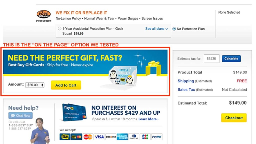
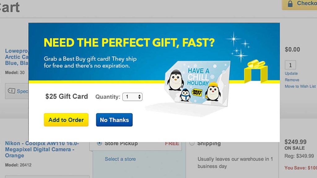
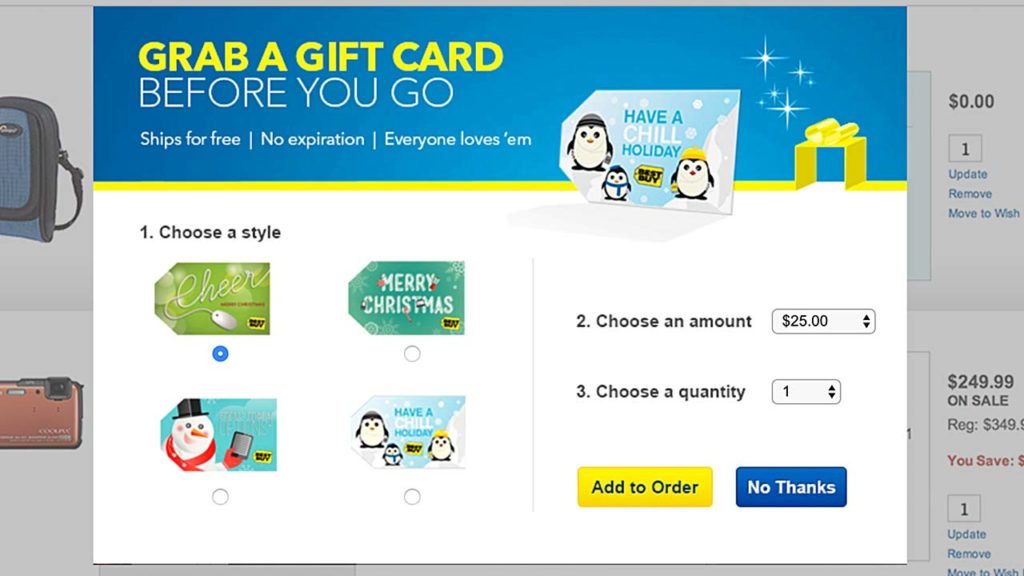
This is a sample of what we tested (and Axure prototype of some of the options)
A. Single card, multiple amount option on the Cart page:
B. Single card, single amount, multiple quantity in a modal when user clicks “Checkout”:
C. Multiple card, multiple amount, multiple quantity option in a modal when user clicks “Checkout”:
There were a couple of other options in the test (mostly variations of card choice and amount), but the results that came back were conclusive: there was absolutely no detriment to conversion with any of the promotion configurations. Users didn’t have a problem clicking “No thanks” if they didn’t want the gift card. Which I found to be a perfectly reasonable response to a promotion. We click “close” all the time and almost automatically, because our goal is on the other side of that window and we just want to get on with it.
Although Steve may have been tempted to run into the nearest engineering meeting and yell, “I told you so!,” he took the opportunity to diplomatically make his case to the team as a whole and present the A/B testing results to everyone.
The really interesting thing is that one of the options tested well, with enough users opting to add a gift card to their basket to make a case for implementing a version of the modal window. Single card (the cute penguin), single amount ($50), with the option to add multiple quantities (option B above) proved to be the best combination of choices. I found this result fascinating as well (and not surprising). Users liked the simplicity of this presentation. Do you want to add a $50 gift card to your order? It was easy to understand at a glance.
The gift card promotion didn’t run at the most peak and highly trafficked time on the site, and that’s a credit to the engineering team’s attention to prudently testing site traffic on a newly launched system. But it did run shortly after peak (Cyber Monday), and did about a million dollars in sales. I love so many things about this story, one of them being that everyone was so passionate about their opinion. But by leaving the question about user behavior open-ended, we were able to learn, and, indeed, it turned out to be a million dollar answer.