I was very excited take on this 6-month contract at Optum Health and work on converting their PDF and printed forms to a digital format. I think it’s fair to say that we all underestimated the complexity of the project. At the time, UHG/Optum Healthcare had somewhere in the realm of 230,000 employees thousands and thousands of patient and provider forms.
It seemed to me at times that this project was an exercise in uncovering the impossibility of putting these forms online. And perhaps, at the root of the difficulty is the overly-complex and confusing beast that we call health care in this country. There is no clean way to standardize many parts of these forms, or to assess what differences are important in forms that are almost the same, but slightly different across hundreds of departments. And many of these differences are due to state and federal regulations that can shift and change yearly or even more frequently. I was tasked with creating a design system and pattern library of form components that would maintain itself, but the reality of the current form system requires an army of people to very manually and meticulously manage the information that comes through (mostly via fax) on these forms.
Despite making little progress toward implementing an online form system in the 6 months I spent at Optum, I gained an important appreciation for the practice of accessibility in web development. And it changed the way I approach my projects. Attention to accessibility has become a foundational part of my process, and it’s something that’s renewed my faith in UX as a practice and a philosophy.
Accessibility review
A few months into the project, we gained a partner from the accessibility team. She was responsible for reviewing the forms I had already designed against the WCAG (Web Content Accessibility Guidelines) to see where the gaps were. She was very good as issuing accessibility demerits and it was eye-opening.
Below is an accessibility review from a form that was put together by another team at Optum. They were using a content management system (that wasn’t really designed for forms) to publish the form. There were a lot of workarounds in the code to customize the text. For instance, the developer had to use <label> tags to insert intro copy and help text. This is a problem for a screen reader because it will expect a form input to accompany a <label>, and when it doesn’t, the user can no longer rely on the integrity of the code to navigate.
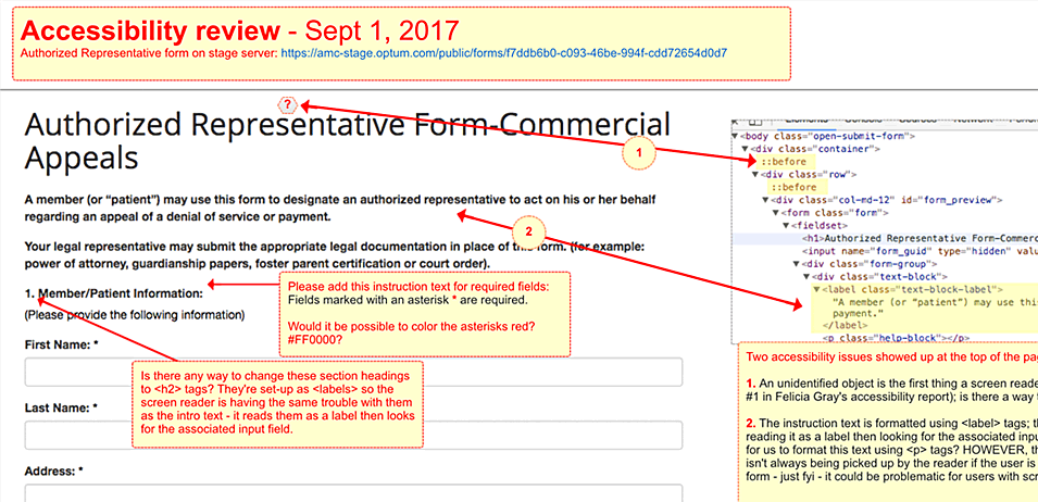
A screen reader relies on the semantic elements in a page (headings, labels, forms, paragraphs) to navigate. A properly structured page gives the user a lot of information about where important content will be. It’s a huge issue, especially in a document that requires a lot of user interaction (like a form) when the page isn’t structured correctly.
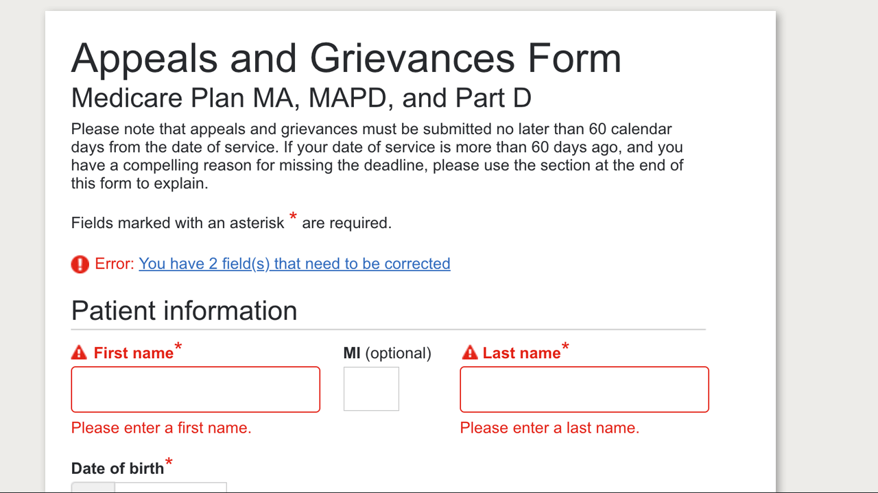
Another important insight gained from the review process was the vital role of instructions on a page—and the need for those instructions to be thoughtfully written and as clear as possible. I have been fortunate to work with content strategists and copy writers a few times in recent years, and they are incredible partners to have on a project. I’m also a writer, but as a designer who has watched users (sighted users) in countless usability sessions completely ignore instructions and help text, I was in the habit of disregarding their importance, too. It became clear after listening to a screen reader consume one of my form pages that my copy was confusing (sample of a multi-step form design below).
Accessibility as a foundational practice
Without a doubt, this project had potential to make a positive impact on Optum employees processing these forms, and providers and patients who would be filling them out. Done well, these forms could streamline a lot of repetitive tasks for Optum employees and free up their time to focus on more complex patient cases. Done poorly, these forms had the potential to make an already difficult process even more arduous.
The insight I gained about integrating accessibility into my UX practice has been invaluable. Going through a design with a screen reader and WCAG standards in mind not only highlights accessibility issues, but basic UX problems as well. The beautiful thing about bringing an accessibility lens to a project is that it improves the experience for everyone. And beginning a project with accessibility in mind keeps everyone on the project (engineers, copy writers, product owners) focused on creating a well-designed foundation in all layers of the code.